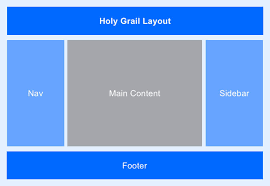
The compatibility of a web designer substantially depends on the layout or format he creates. A web designer should be able to understand almost all about the grid. If you are a beginner or new in this industry then this article will surely help you. In this article, we are going to discuss all about UI Grid layout. So, let’s get started to discuss;
A grid is a structure of lines that place everything in a range of orders. Grid works as a framework that will surely help designers to manage the arrangement of UI elements. Moreover, it’ll help to enhance visual balance with great consistency.
Grid Designing layout
As we are discussing web designing, the grid is a set of an infinite number of rows and columns that help the developer to align, design or arrange format according to the client’s demand. Lines may be real or imaginary. You can also get the importance of the grid as it is considered the backbone of the structure.
- Symmetric Layout
- Asymmetric Layout
The difference between the two is a bit minor. In symmetric layout, data is assigned in order. While in asymmetric layout, there is no fixed center point.
UI Grid Layout is divided into two types:
Why a designer or a developer should use a grid?
Multiple factors are available that make you sure that using a grid while formatting or designing a site is beneficial. Here, I’ll tell you the few once;
- Organized UI Elements.
- Consist way of working.
- Easy for developers.
- Helpful in symmetric layout.
Improve your UI Design skill using grid
If you are a newcomer or new in the field of web designing then, you need to follow the few tips in your mind;
Customize your grid according to design
You need to customize your grid according to the layout or project on which you are working. Adjust row, column, length, width, and block size. Furthermore, alignment or arrangement helps you to align text, images, and other elements in order.
Organized Way of formatting
All of the elements should be place in order. If you are working for a client then you should use an asymmetric layout to place all the things in order. On the other hand, if you are working creatively then you should try an asymmetric layout to do work as you want. The asymmetric layout is also known as a broken grid.
Testing
Testing is one of the most important points. Try to verify your design, format, website, or whatever you’re developing as much as you can. Make sure to check and verify the format before delivering it to the client.
Commonly used Grids in web designing
Multiple grids are available that are using for various purposes. From the various range, I am going to describe a few below;
Website grill format includes the latest designs that may look artistic and be the reason for inspiration.
Isometric Ecommerce CSS Grid is a format of shoe shopping websites. Develop in a way to get attraction and response from the client.
Bootstrap Grip System is an internet website that having 12 columns grid.
Material responsive Grid is one of the most popular grids in the market that must be attractable due to its multiple sizes and resolution.
In the field of grid layout, Web designing Companies in Pakistan provides their efficient services to their client. The most trending web designing companies in Pakistan are RECURSHIP, Square63, and Aurora Solutions. If you want a more convenient and reliable place then I’ll recommend you to visit WebMasters EYE and get an affordable package in-budget and minimum time.
